| Complete Publications in PDF form |
| |
This section of Public Collectors is devoted to scans of entire publications, cover to cover, in PDF form. You can download the PDFs by clicking on the scan of the publication cover. All of the publications included are believed to be out of print, hard to find, and in some cases unique, rare or exceedingly expensive to purchase on the secondary market.
These materials are being made available for noncommercial and educational use only. All rights belong to the author(s). Scanning an entire publication and paying for the web hosting so people can see it is a labor of love. It should be obvious that Public Collectors is sharing these publications because they are interesting, deserve a broader audience, and shouldn't linger in obscurity. If, however, you are the copyright holder of these materials and would like to see them removed, please contact: marc [at] publiccollectors [dot] org. If you have complete PDFs of publications to submit for inclusion, contact Public Collectors using the same email. |
|
| |
|
| |
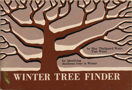
Winter Tree Finder, by May Theilgaard Watts and Tom Watts, 1970, 64 pages, Nature Study Guild., Berkeley, CA, 4" X 5 13/16" |
[Click image to download. 12.6 meg PDF file] |
| |
A pocket-size guide to identifying deciduous trees in the Winter, when we don't have leaves to go by and must look at other factors. This little book is designed with a visually pleasing use of two color printing and tons illustrations on every page. The back cover even has a five inch long ruler printed on it for use out in the field.
|
| |
|
| |
|
| |
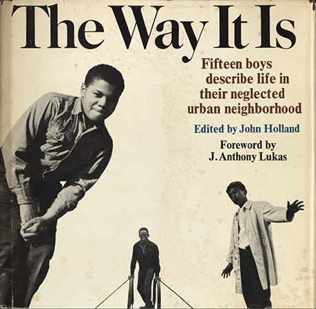
The Way It Is, Edited by John Holland, 1969, 106 pages, Harcourt, Brace & World, Inc., New York, 8 1/4" X 8 8 5/8" |
[Click image to download. 109.5 meg PDF file] |
| |
From this book's interior jacket: "The stark reality of life for millions of young people in neglected urban neighborhoods is presented here by fifteen boys from such a community. Their homes are
in the Williamsburg section of Brooklyn, New York, and they reveal in their own words and their own photographs what it is like to live there. Through their eyes the reader explores the neighborhood-from the rooftops down to the streets-where the common complaint is "nothing to do." He visits their school and its adjoining park, meets their families and friends, and comes face to face with life, and sometimes death, in this bleak environment where the future holds little hope apart from the spirit and potential of the young. ... In countless urban neighborhoods throughout the nation, this is the way it is."
|
| |
|
| |
|
| |
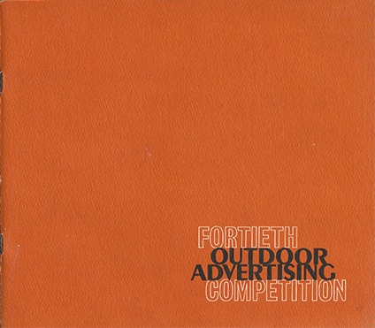
Fortieth Outdoor Advertising Competition, by Institute of Outdoor Advertising, 1972, 40 pages, New York, New York, 9" X 8" |
[Click image to download. 31.9 meg PDF file] |
| |
This color catalog presents the results of an annual competition focused on billboards and other outdoor ads, judged by a panel of experts in the field (all middle-age white men) who select ads based on "Composition, Total Concept and Communication Ability." The results are grouped into advertising images and Public Service messages. Not surprisingly, the results of these competitions appear to reflect the values of the jury so you can expect to see ads for such enterprises as Bank of America, Detroit Police Officers Association, Sizzler Family Steak House, Terminix and the U.S. Air Force and nothing remotely counter-cultural. Nonetheless, this is a fascinating survey of graphic design as applied to billboards and other outdoor ads. |
| |
|
| |
|
| |
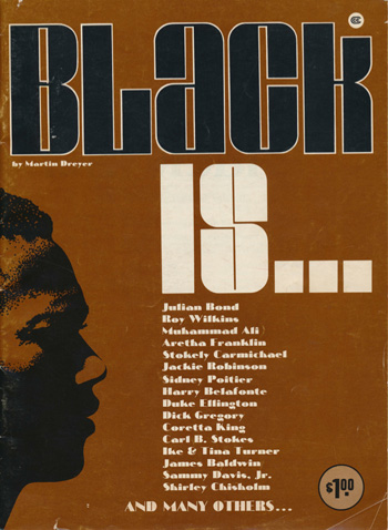
Black Is..., by Martin Dreyer, 1971, 68 pages, Lawrence Field & Associates, Inc., New York, 8 1/4 " X 11 1/4" |
[Click image to download. 114.3 meg PDF file] |
| |
Black Is... is a photo-heavy magazine celebrating several generations of key figures in black history across many fields and disciplines. It includes black athletes, musicians, politicians, writers and revolutionaries. The magazine is particularly enjoyable for the many photos sourced from United Press International that are accompanied by short biographies. From the introduction by Dreyer: "In these pages you see some of the many blacks who have made the breakthrough, who say with hope and compassion to their brothers and sisters: "Follow me. The only way we can go from here is up."" |
| |
|
| |
|
| |
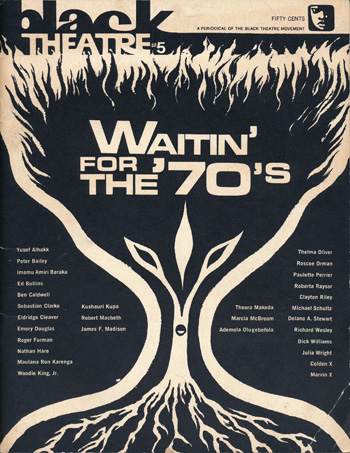
Black Theatre - A Periodical of the Black Theatre Movement, #5, 1971, 60 pages, The New Lafayette Theatre, Harlem, New York, 8 3/8" X 10 3/4" |
[Click image to download. 71.5 meg PDF file] |
| |
Black Theatre was a publication of the Black Arts Movement. According to the Wikipedia entry on the movement, six issues of this publication were produced between 1969-72. This is issue number 5. It includes writings, discussions, art, poetry, and essays by many of the key figures in this deeply influential and radical movement. Included in this issue: Yusef Alhakk, Peter Bailey, Imamu Amiri Baraka, Ed Bullins, Ben Caldwell, Sebastiane Clarke, Eldridge Cleaver, Emory Douglas, Roger Furman, Nathan Hare, Maulana Ron Karenga, Woodie King Jr., Kushauri Kupa, Robert Macbeth, James F. Madison, Theora Makeda, Marcia McBroom, Ademola Olugbefola, Theima Oliver, Roscoe Orman, Paulette Perrier, Roberta Raysor, Clayton Riley, Michael Schultz, Delano A. Stewart, Richard Wesley, Dick Williams, Julia Wright, Golden X, and Marvin X. |
| |
|
| |
|
| |
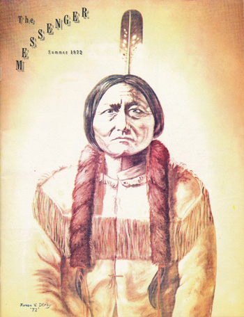
The Messenger, Summer 1972, Vol. 57, No. 2, 40 pages, Sioux Falls, South Dakota, 8 1/8" X 10 5/8" |
[Click image to download. 75.2 meg PDF file] |
| |
The Messenger was a quarterly periodical published by and for the men of the South Dakota State Penitentiary, Sioux Falls, South Dakota, with the permission of the warden. “The purpose of this magazine is to give the inmates an opportunity for self expression, to provide them a medium of discussion of public problems, to foster better understanding between inmates and the general public, and to be constructively informative.” |
| |
|
| |
|
| |
How To Build A Beer Can Mortar, Delta Press Ltd, 1977, 8 pages, El Dorado, Arkansas, 8 1/2 " X 11 sheets folded into half-letter size envelope |
[Click image to download. 3.4 meg PDF file] |
| |
This packet contains plans to build a beer can mortar for purposes of safe entertainment and enjoyment. This device is not a mortar with a barrel made from a beer can, as assumed at first, but rather a more heavy-duty device designed to fire beer cans filled with sand or gravel up to 500 yards. As the literature itself states: "We can assume no responsibility for the manner in which the enclosed information is used." Don't hurt yourself or others! |
| |
|
| |
|
| |
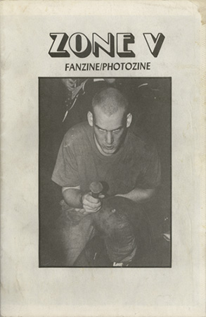
Zone V Fanzine/Photozine , issue 1, 1983, 48 pages, Jim Saah, Wheaton, Maryland, 7 1/2 " X 11" |
[Click image to download. 53.5 meg PDF file] |
| |
This is the first of a total of two issues of Zone V that were published. This offset 'zine has a spare layout that is packed with Jim Saah's excellent photos of some of the greatest American hardcore bands of this period. Bands included are: Black Flag, Minor Threat (see cover), Hate from Ignorance, Insurrection, Heart Attack, Naked Raygun, Marginal Man, Faith, Void, Flipper, The Meatmen, Circle Jerks, Channel Three, Government Issue, Nig-Heist, Negative Approach, and Scream. Also included are interviews with Henry Rollins from Black Flag and Tesco Vee of The Meatmen, a New York scene report written by Thurston Moore of Sonic Youth, Detroit and Los Angeles scene reports, and a Minor Threat family tree. |
| |
|
| |
|
| |
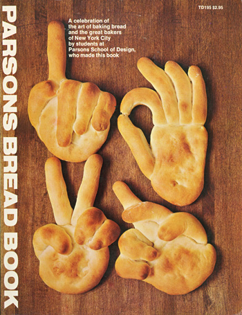
Parsons Bread Book, 1974, 76 pages, Harper & Row, New York, 8 1/2 " X 11" |
[Click image to download. 33.1 meg PDF file] |
| |
From the front cover: "A celebration of the art of baking bread and the great bakers of New York City by students at Parsons School of Design who made this book." Made by David Blumenthal, Vicky Coleman, Chris Grana, Sherry Gutberlet, Peter Mattes, Ed Mazzola, Fran Rappaport, Dot Scott, Carolyn Sievers, Pat Valle, Bonnie Weber, and Cipe Pineless Burtin, faculty. This book started as a student publication produced over three months in 1973 and was produced as a yearbook for the school that "was representative of student interests and values without being strictly autobiographical." This edition was published by Harper & Row for a wider audience. Thanks to the blog Gravel & Gold who posted about this book and brought it to my attention, which compelled me to find a copy and scan it. |
| |
|
| |
|
| |
Author unknown, untitled, circa mid-late 1990s, 22 pages, self-published collection of photocopies, 8 1/2" X 11" |
[Click image to download. 5.7 meg PDF file] |
This PDF of a document that was originally hand-written and photocopied, is filled with stream of consciousness writings on everything from bible passages and church experiences to speculations on the names of various businesses including multiple storage facilities and Pizza Hut. Constantly disrupting the writing are searches for words within words. It is a text that will test the patience of most, however its density and extremism have an unsettling power.
The donor of this PDF, Giles Hefferan, writes, "The manifesto was given to a friend of mine somewhere around 1997 or 98 in Grand Rapids, Michigan. A man who was presumably the author came in to my friend's workplace and handed her a copy and said something like 'you might want this', almost apologetically. It was photocopied and I made more copies and gave them to my friends— as far as I know it is complete, at least since I have had it, but I know that it appears to be missing pages and sometimes repeats page numbers."
|
|
|
| |
|
| |
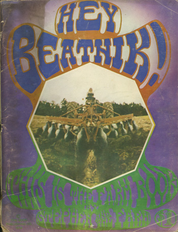
Stephen Gaskin, Hey Beatnik! This is the Farm Book, 1974, 104 pages, The Book Publishing Co. |
[Click image to download. 181.6 meg PDF file] |
This PDF is a collaboration between Public Collectors and The Library of Radiant Optimism for Let's Re-Make the World. Public Collectors provided the book and scan and Let's Re-Make wrote the following description:
The Farm is a long running intentional community near Summertown, Tennessee, in the south central part of the state. It sits on 1700 acres and estimates of the current population range from 175-200 people. The Farm was started in 1971 by Hippies who migrated from San Francisco, making the trek in a large iconic caravan, to rural Tennessee. They were following Stephen Gaskin, a charismatic hippie whose "trips" – he later calls them "visions" – provided the spiritual connection that he and many others were looking for in building a place like the Farm.
This book, written by Stephen Gaskin after 2 years of living at the Farm, gives you a good sense of the values and the activities of the people, at this point around 600, that lived there. The book chronicles their caravan, which took 7 months to land them in their current locale. It wasn't an easy journey and the book lays out some of the problems they encountered. It chronicles their growing awareness of farming and raising their own food, their interaction with neighbors, especially older farmers who they found out were an incredible resource of practical information about agricultural practices in the region. The book encourages others to follow and make their own situations by sharing information and experiences in an open and direct manner. The book today is a study in the groundwork for an intentional community. Page 15 is devoted to enumerating exactly how many acres had to be used to generate the produce needed to sustain their population for one year. There are pages on raising horses, their communal system of banking, building methods, healthy eating, home birthing, and some idiosyncratic gems like "tripping instructions." This is not what you think and has nothing to do with drugs; those are are covered later in the book. Rather "tripping instructions" describe the interactions and relationships of Farm folks. The people of the Farm valued truthfulness, as they saw it, and challenging each other on their shortcomings. This page lets a visitor at that time know a little of what to expect from the people who lived there.
Large parts of Hey Beatnik! are written in Hippy-speak. Changing language to more accurately reflect a culture shift and create a revolution was a popular strategy at the time, and one held dear by the Farm community. The language shouldn't distract you from the very serious, and continuing, utopian experiment these folks undertook. The Farm is well known for many things, among them the incredible amount of work they have done on home birthing (see Spiritual Midwifery (Click title), by Ida May Gaskin). You can visit the Farm today. They offer classes in midwifery, permaculture, eco-village building and more. |
| |
|
| |
|
| |
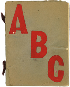
Author unknown, ABC, undated, 20 pages, unique hand-made book, 4 1/2 " X 6". |
[Click image to download. 4.8 meg PDF file] |
This delicate hand-made book was found amid a pile of papers, scrapbooks and old homework assignments from the mid-late 1930s at a flea market in Rosemont, Illinois. It is an alphabet book, with a hand-written bible quote to reference each hand-cut collaged letter. Additional collaged images are included in the margins. I'm guessing that the handwriting inside is by an adult who helped with this collaboration/indoctrination. |
| |
|
| |
|
| |
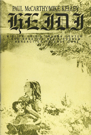
Paul McCarthy & Mike Kelley, Heidi: Midlife Crisis Trauma Center And Negative Media Engram Abreaction Release Zone, 1992, 40 pages, Gallerie Krinzinger, Vienna, Austria, 5 1/2 " X 8 1/4 ". |
[Click image to download. 14.1 meg PDF file] |
This 1992 booklet for a collaborative exhibition is designed more like an artist book. There is an essay by Timothy Martin, along with CVs for both artists and illustrations of their individual works, however the most unique feature is the collection of source photos that inspired this project. Among the sources are images from The Texas Chainsaw Massacre, an Otto Dix painting, a tattoo design and Austrian kitsch. |
| |
|
| |
|
| |
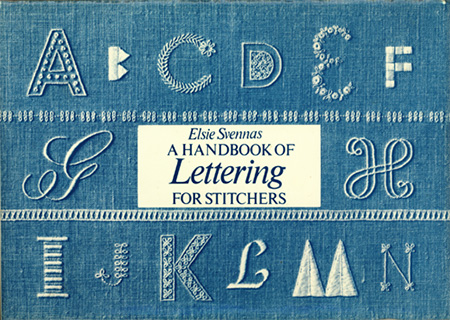
Elsie Svennas , A Handbook of Lettering for Stitchers , 1973, 100 pages, Van Nostrand Reinhold Company, New York, 8" X 5 5/8 ". |
[Click image to download. 36.1 meg PDF file] |
A real treat for stitchers and lovers of lettering! From the inside cover flap: "The Author has set out in this book with three distinct aims. Firstly to write a concise history of Lettering, tracing the development from the simplest markings to the elaborate and decorative monogram. Secondly, to give an an illustrated dictionary of all stitches that are suitable for carrying out any lettering. Finally to display in an illustrated section the great variety of lettering designs suitable for various stitches using every letter of the alphabet as examples." |
| |
|
| |
|
| |
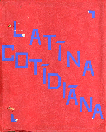
Robert Chenoweth, Latina Cotidiana, 1940?, unique publication, 42 pages, handwritten with various collaged elements, cover: 8 1/2" X 10 1/2". interior pages: 7 1/2" X 9 1/2". |
[Click image to download. 16.3 meg PDF file] |
This publication is clearly an ambitious student's homework assignment - one of four different assignments that I acquired by the same author at a flea market in Chicago. Its subject is ancient Roman culture and Latin. What makes this brad-bound piece particularly enjoyable is the use of many collaged elements from various books and newspapers. The numerous clippings, some of which date from 1940, either show examples of Roman history and historical figures, or are used to note examples of Latin, or English words derived from Latin. A variety of popular sources of images and text are employed, ranging from comic strip panels to newspaper ads. |
| |
|
| |
|
| |
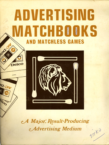
Advertising Matchbooks and Matchless Games, 1977?, Lion Match Corporation of America, Chicago, 52 pages, offset with tipped in matchbook covers, 8 1/2" X 11". |
[Click image to download. 29.7 meg PDF file] |
This unusual, richly illustrated publication appears to be a sales catalog for Lion Match Corporation of America. It features numerous matchbook designs and a great trove of old line art and matchless game graphics. The publication also includes over fifty actual matchbook covers that are tipped in to display the range of styles and possibilities that customers could take advantage of to advertise their business or service. Matchcovers.com identifies the company as such: "Lion Match Co. -- Located in Chicago, IL, known in later years as Lion Corporation of America. It originally started business in 1917, in Brooklyn, NY, and began using the Safety First footer wording in 1922. Today, this company produces a general advertising specialty line. It ceased primary matchcover production in 1995, but still produces advertising specialities." |
| |
|
| |
|
| |
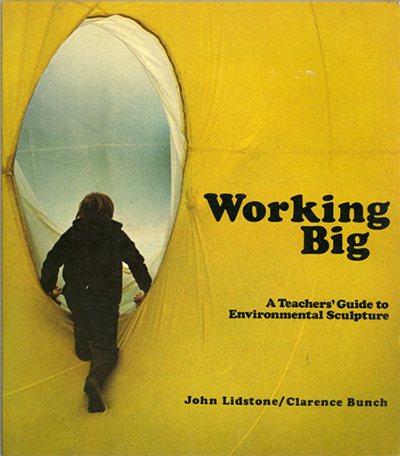
John Lidstone & Clarence Bunch, Working Big: A Teacher's Guide to Environmental Sculpture, 1975,Van Nostrand Reinhold Company, New York, 100 pages, offset, 8 1/8" X 9 1/4". |
[Click image to download. 38.8 meg PDF file] |
This exciting guide applies some of the ideas of artists and writers like Ant Farm, Otto Piene and Willoughby Sharp to large scale art projects that can be executed with children. A pull quote from the back cover ..."Children who have the opportunity to work together with large-scale materials are more likely to have meaningful, in-depth experiences than those whose background has been restricted to participation in small-scale classroom activities. ...A school should recognize that (such projects are) not only a logical extension of the classroom curriculum but also a way that students can become involved with art forms that are relevant to the world they live in." |
| |
|
| |
|
| |
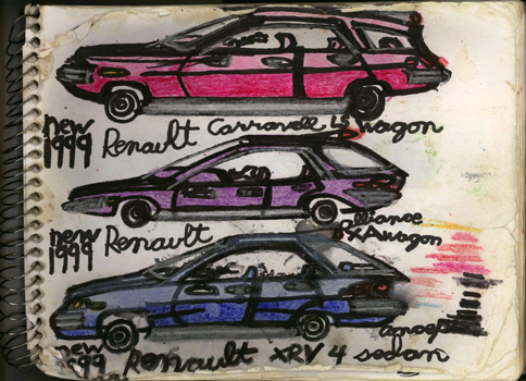
Wayne Mazurek, Sketchbook, circa 1997-2000, 54 pages, marker and pencil on paper, 8 1/2" X 11". |
[Click image to download. 41.1 meg PDF file] |
Wayne Mazurek's primary creative focus is to design concept cars of the near future. With great care, he contemplates automotive history and renders his ideas for future models. These drawings fill sketchbooks that are used not merely for private reflection, but as a social tool to provoke dialogue about car design with others. Mazurek engages in these dialogues with people who drive cars as well as representatives of car manufacturers themselves who Mazurek sometimes meets at auto shows in Chicago. Generally Wayne is thinking ahead only several years into the future, so while this sketchbook is undated, I would guess that these models from 1999 to 2002 were drawn between 1997 and 2000. This publication differs from others that have been featured on this website thus far, in that it is a unique work rather than a publication produced in multiple. However, given the energy with which Wayne Mazurek attempts to share his work with new people that he meets, it feels appropriate to include his sketchbook and extend his drawings via the internet. Additional works by Mazurek can be viewed here: http://www.littlecityarts.org/pages/wayne_mazurek/51.php |
| |
|
| |
|
| |
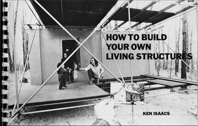
Ken Isaacs,
How To Build Your Own Living Structures, 1974, Harmony Books, New York, 137 pages, offset, spiral bound |
[Click image to download. 425.6 mb PDF file] |
This high resolution scan was donated by the The Library of Radiant Optimism for Let’s Re-Make the World. They write: "This book is a beautiful guide about how to make a variety of flexible experimental indoor interiors, storage units, and a microhouse. The microhouse is a flexible creation of architect, Ken Isaacs. The modular design is based on stacked tetrahedrons, which can be moved in and around each other providing shelter and dividing living space in a creative way. The book gives you step-by-step instructions with plans for many different versions of Isaac’s original designs interspersed with ideas about simplicity, and getting rid of our personal possessions. The book is type written and spiral round in a nice Do-It-Yourself aesthetic, and Isaacs writes in a genial manner as if he were sitting across the table from you. He muses on the philosophical meanings of surplus and uses the designs as a means of addressing life as whole; a simple place to raise a family and house extended family that has a low impact on the surrounding natural environment." Thanks to Let's Remake, and Sarah Lewison who lent them her copy for scanning, for sharing this. |
| |
|
| |
|
|
| |
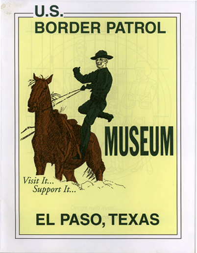
U.S. Border Patrol Museum, El Paso, Texas, Undated, 16 pages, offset |
[Click image to download. 3.8 mb PDF file] |
A coloring and activity booklet for children of all ages where, among other things, readers get to meet Koroc, the dog from Holland that searches for people and illegal drugs. Good luck completing the word finds and the maze! Thanks to Deborah Stratman for the gift of this publication.
|
| |
|
| |
|
| |
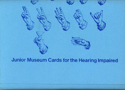
The Art Institute of Chicago, Junior Museum Cards for the Hearing Impaired, 1979, The Art Institute of Chicago, 78 pages, offset, loose cards in paper wrapper. |
[Click image to download. 7.8 mb PDF file] |
Did you ever want to know how to say "Museum", "Abstract" or "Gallery" in sign language? This flash card set, intended for a general introductory visit, will show you how. This card set, which was scavenged from a dumpster at the Art Institute about ten years ago, features an enjoyable collection of rudimentary drawings that attempt to convey the most basic essentials of the museum and the field of art, in addition to providing an interesting lesson in signing.
|
| |
|
| |
|
| |
Michalis Pichler, hearts, 2008, Michalis Pichler, AGRA, and Revolver, Germany and Athens, 220 pages printed, offset, perfect bound. |
[Click image to download. 10.7 mb PDF file] |
This book is a playful examination by German artist Michalis Pichler who has an affinity for trash. In the past he has documented patriotic garbage - with a special interest in Pizza boxes bearing American flag imagery. In this book Pichler focuses his camera on the heart symbol, photographing garbage bearing this image and, perversely, the space on the ground occupied by the garbage after it has been picked up. In case that isn't enough, Pichler also transcribes every bit of text on each item and presents it in clinical typed reproduction on the opposite page. Special thanks to Michalis for providing Public Collectors with a PDF of the digital layout from the book. More of Michalis Pichler's work can be seen at www.buypichler.com. |
| |
|
| |
|
| |
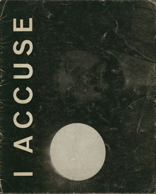
Jean Toche, I Accuse, March 26 - April 9, 1968, Gallerie Le Zodiaque, Brussels, 20 pages, offset, staple bound. |
[Click image to download. 7.9 mb PDF file] |
A rare catalog from an early solo exhibition by Jean Toche of Guerrilla Art Action Group (GAAG). This booklet documents Toche's little-known aggressive light environments. The catalog, which is also a kind of artists' book, features text in English and French. Thanks to Jean Toche for allowing Public Collectors to incude a scan.
|
| |
|
| |
|
| |
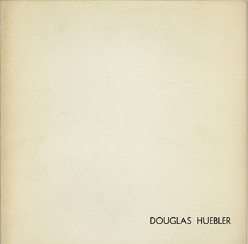
Douglas Huebler, May 8 - June 14, 1970, The Addison Gallery of American Art, Phillips Academy, Andover, Massachusetts, 24 pages, offset, staple bound. |
[Click image to download. 4.7 mb PDF file] |
An obscure exhibition catalog that artist Douglas Huebler treated more like an artist book. Along with some short statements concerning his ideas, the booklet presents a variety of his "Variable Pieces". The usual dry humor is much in evidence. As the sole Forward statement by Director C.C. Cook accurately states: "Douglas Huebler is a real artist".
|
| |
|
| |
|
| |
Céline Duval - Untitled, 2001, cneai - Chatou, France and École Régionale des Beaux-Artes de Caen - Caen, France, 32 pages, offset, staple bound. |
[Click image to download. 3.8 mb PDF file] |
This is one of French artist Céline Duval's first books and it remains a favorite. Consisting entirely of unaltered found postcards, the postcard-sized book arranges the cards into a very subtle and clever sequence that viewers should be left to discover on their own. Originally printed in an edition of 600 copies, this is out of print. Thanks to Céline for letting Public Collectors include a scan. For more of Céline Duval's work, visit her website: www.doc-cd.net |
| |
|
| |
|
| |
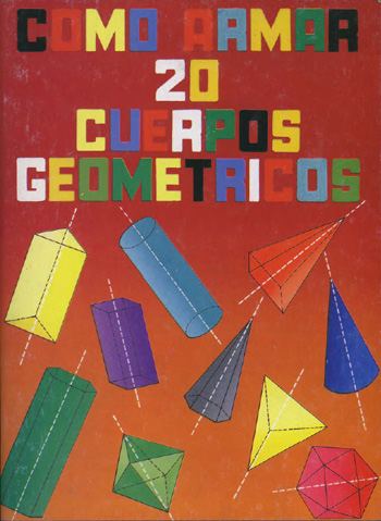
Carlos Chavez - Como Armaa 20 Cuerpos Geometricos, undated, Gomez-Gomez Hnos. Editores, Mexico, 44 pages, 6 3/4" X 9", staple-bound |
[Click image to download. 5.4 mb PDF file] |
This book shows how to cut and fold paper or cardboard to make 20 different three dimensional geometric shapes; a tool that can be used with young children or adults to build complex structures.
|
| |
|
| |
|
| |
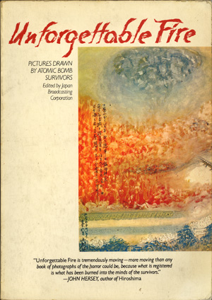
The Unforgettable Fire - Pictures Drawn by Atomic Bomb Survivors, Edited by Japan Broadcasting Corporation, 1981, Pantheon Books, New York, 116 pages, offset, perfect bound. |
[Click image to download. 35.4 mb PDF file] |
From the back cover: "The art in this book was a response to a request broadcast on a morning television program in Japan for drawings from atomic bomb survivors. The results were immediate. The television station was inundated with drawings. So powerful were the survivors' desires to share their memories that they turned to whatever materials were at hand – pencils, crayons, watercolors, Magic Markers, colored pencils, India ink – and drew on the backs of calendars, advertisements, bills, or even the paper used to cover Japanese sliding doors. Some drew on the backs of children's scribbled papers, probably those of their grandchildren." |
| |
|
| |
|
| |
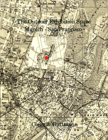
Clegg & Guttmann - The Outdoor Exhibition Space: Munich - San Francisco, 1992, published by K-Raum Daxter, Munich, 52 pages, 8 1/2 " X 10 5/8 ", offset, perfect bound. |
[Click image to download. 18.7 mb PDF file] |
From the introduction by Karola Grässlin: "Clegg & Guttmann declared a road underpass with no relation to art to be an exhibition space that, for the public, was an unfamiliar one and brought back (in the form of photographs resulting from this expansion of potential art sites) the exhibition to its original location, the K-raum Daxer sponsored by art patrons, Mr. and Mrs Daxer." |
| |
|
| |
|
| |
|
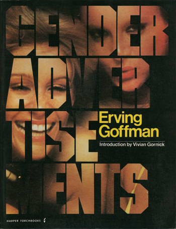
Erving Goffman - Gender Advertisements, Introduction by Vivian Gornick. 1987 Harper Torche edition, 100 pages, 8 1/2 " X 11", offset, perfect bound. |
[Click image to download. 53.3 mb PDF file] |
"Gender Advertisements is concerned with the behavioural representations of our cultural assumptions about the nature of the sexes. The first part of the book deals with the properties of gender displays... Erving Goffman then discusses the nature of photography and the relations of photographs to what they purport to picture. Finally he presents in detail the ways in which gender, especially the female gender, is presented in popular advertisements." - from the back cover. |
| |
|
| |
|
| |
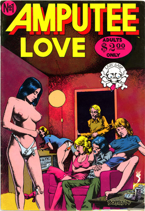
Amputee Love No. 1, Feb. 1975, 36 pages, published by Last Gasp. |
[Mature content. Adults only. Click image to download: 16.4 mb PDF file] |
This comic was written by a woman named Rene (identified as a double amputee and listed only by her first name) and drawn by her husband Rich. The cover art is by Brent Boates. |
|
|
|
| |
|
| |
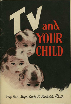
Very Rev. Msgr. Edwin B. Broaderick, Ph.D. - TV and Your Child, 1955, published by The Paulist Press, 52 pages, 5" X 7.2", offset, staple-bound. |
[Click image to download. 6.9 mb PDF file] |
An attempt to deal with the then very new medium of television and its programs. Broaderick, the author, was the first director of radio and television for the Archdiocese of New York. Sample quote: "The vivid attraction of TV, like the rhythmic coiling of a snake, can be so fascinating that the question "Is it poisonous?" may not arise until the children are helpless in its grasp." |
| |
|
| |
|
| |
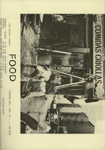
FOOD, an exhibition by White Columns, curated by Catherine Morris, published by Walter König, 52 pages, 8 1/4" X 11 11/16", offset, staple-bound. |
[Click image to download: 10.8 mb PDF file] |
An out of print and hard to find exhibition catalog devoted to FOOD, a collaborative artist-run restaurant in New York City founded by artists Gordon Matta-Clark, Carol Goodden and Tina Girouard in 1971.
|
| |
|
| |
|
| |
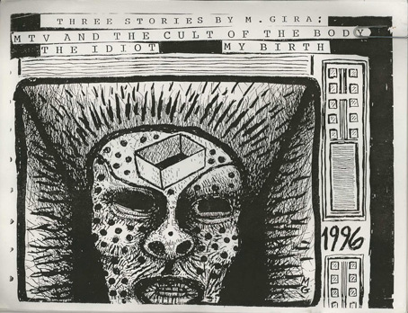
Michael Gira - Three Stories By M. Gira: MTV And The Cult Of The Body / The Idiot / My Birth, 1996, self-published, 25 single sided 8.5" X 11" photocopies. |
[Click image to download: 9.8 mb PDF file] |
From the Swans Discography: "This photocopied packet of stories was sold on the 1997 tour. It includes four illustrations by Gira (one for each story and the cover drawing). The cover is dated 1996 but the copyright information is listed as 1996/97." There are actually six drawings in total but Gira's astonishing writing is the primary reason for posting this obscure publication.
|
| |
|
| |
|
| |
trans formation : arts communication environment, N° 1. 1950, edited by Harry Holtzman, 64 pages, 8 7/16" X 11", staple-bound. |
[Click image to download: 27.4 mb PDF file] |
A truly multi-disciplinary journal which affirmed that "art, science, technology are interacting components of the total human enterprise..." This publication, which existed for only three issues, treated the arts and sciences "as a continuum."
|
| |
|
|
|
| |
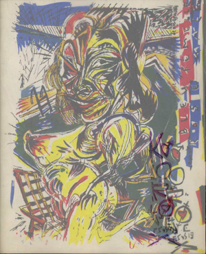
Bruno Richard - Elles Sont De Sortie (E.S.D.S.) #19 Kolor Love, 1986, published by Futuropolis, 44 pages, 6 " X 7.5", color printing with rubber stamp on cellophane cover, staple-bound. |
[Mature content. Adults only. Click image to download: 18.3 mb PDF file] |
This early publication by Paris-based artist Bruno Richard consists of garishly colored and highly aggressive drawings abstracted from photos of women and men in the military. This rare publication is posted with kind permission from the author. To see more visit: http://lsont2sortie.free.fr/ |
| |
|
|
|
| |
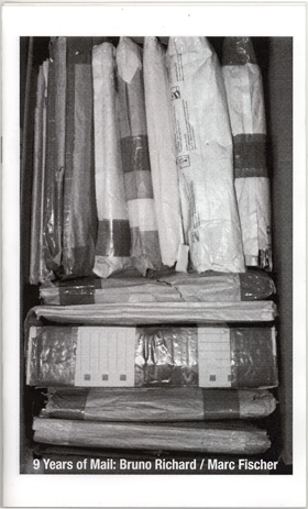
Marc Fischer - 9 Years of Mail: Bruno Richard / Marc Fischer, 2006, published by Columbia College Center for Book & Paper, 24 pages, 8.5" X 5.25", black and white laser printing, staple-bound. |
[Mature content. Adults only. Click image to download: 1.8 mb PDF file] |
Created for the occasion of an exhibition at Columbia College, Chicago titled "Exalted Trash", this booklet focuses on the friendship and postal correspondence of artists Fischer and Richard. The booklet includes examples of their mailings to each other, along with a brief interview with Bruno Richard by Marc Fischer. |
| |
|
|
| |